Tuesday, 27 December 2011

Common opening credits order

While there are numerous variations most opening credits use some variation of the basic order noted within:
  • (NAME OF THE STUDIO)
Name of the studio that is distributing the film and may or may not have produced it (Walt Disney Pictures, Columbia, Lions Gate, Universal, etc.).
  • (NAME OF THE PRODUCTION COMPANY)
Name of the production company that actually made the film or name of the investment groups or companies that financed a substantial part of the film (usually credited as "in association with" or "A (studio name) production.").
  • (PRODUCER NAME) PRODUCTION
  • STARRING
Principal actors, (Sometimes the stars' and director's credits will be reversed, depending on the star's deal with the studio; sometimes, as in the Rodgers and Hammerstein films, or as in all three film versions of Show Boat, or, as in many of Disney films, the title of the film will be shown before the names of its actors; sometimes, as in many of Cannon's films, the name(s) of the principal actor(s) will be shown before the name(s) of the producer(s), i.e. "The Cannon Group presents X in a Golan-Globus production of a Y film").
  • (FILM'S TITLE)
Name of the film.
  • FEATURING
Featured actors.
  • CASTING or CASTING BY
Casting director.
  • MUSIC or MUSIC COMPOSED BY or ORIGINAL SCORE BY
Composer of music.
  • PRODUCTION DESIGN or PRODUCTION DESIGNER
Production designer.
As a variation some of the below may be noted:
  • SET DESIGN
  • COSTUMES or COSTUMES BY or GOWNS (older movies)
  • HAIRDRESSER
  • MAKE-UP ARTIST
  • SOUND RECORDING (older movies)
  • VISUAL EFFECTS DIRECTOR or VISUAL EFFECTS BY
  • EDITOR or EDITED BY
Editor.
  • DIRECTOR OF PHOTOGRAPHY
Director of photography.
  • PRODUCER or PRODUCED BY, EXECUTIVE PRODUCER
Producers, co-producers, executive producers, 'also produced by' (credited for various reasons according to contracts and personal scrutiny of the principal producer). Often, though, the name of the producer will be the next-to-last opening credit, just before the director's name is shown.
  • BASED ON THE BOOK (PLAY, GRAPHIC NOVEL etc.) BY or FROM A PLAY/BOOK BY (older movies)
If based on a book or other literary work.
  • BASED ON THE CHARACTERS BY or BASED ON THE CHARACTERS CREATED BY
If based on characters from a book or other media.
  • STORY or STORY BY
Person who wrote the story on which the script is based, gets "story by" credit, and the first screenplay credit, unless the script made substantial changes to the story.
  • WRITER(S) or WRITTEN BY
Screenplay writers. The Writers Guild of America allows only three writing credits on a feature film, although teams of two are credited as one, separated on the credits by an ampersand ("X & Y"). If each works independently on the script (the most common system), they are separated by an "and". If more than two persons worked on the screenplay, the credits may read something like "screenplay by X & Y and Z and W" X and Y worked as a team, but Z and W worked separately.
  • DIRECTOR or DIRECTED BY
Director. The Directors Guild of America permits a film to list only one director, even when it is known that two or more worked on it. Except in very rare cases (a death in mid-production) there is only one directing credit.

Juno opening scene

 
This is the opening sequence of Juno. This was done in school while watching the opening sequence of Juno, this is to help us plan how our opening sequence will look like. This was a really good practice because it helped to us create fascinating ideas for our 2 min film-intro

Monday, 26 December 2011

Opening Title Sequence of GoldFinger.


     This is the Opening Title Sequence of Goldfinger.
    The Timeline Starts from 00.00 and Ends at 2.45.
The use of varies colours is used to
 illustrate the people with the most important jobs.


     I noticed that the title of the film didn't come last,
     it came quite early to be precise 0.50

                                     DIRECTOR: Guy Hamilton.
 
                                           EDITOR: Peter Hunt

SPECIAL EFFECTS BY: John Stears
PRODUCED By: Harry Saltman

 
I found This analysis of Goldfinger Opening sequence very useful because it gave me and idea and a head start for my own film intro. The drawings of timeline and the annotation and analysis helped me to break each steps down and build my title sequence gradually. I have learnt alot from this, for example i learnt that film titles do not come last, instead it is usually who it is Directed by. In addition this analysis showed me how the genre of the whole film is displayed in only a short amount of time. The Genre was shown in the video through the mise en scene and most importantly the flow/pace of the music.

Tuesday, 13 December 2011

The Post Preliminary task ( The first not so good version)

This is the Preliminary task we first did, this project wasn't that good because a couple of mistakes were made , an example of the mistake we made was that when an actor is speaking, the camera is not capturing he's face. According to my media teacher "this is not right" so we had to re-shoot the whole thing. This clip is very important because it helped us to realize how easy it is to make mistakes on projects like this.

Thursday, 1 December 2011

The Main Location

This is the main location we have chosen for the first scene, and this is where the practice intro was recorded. Black and white filter was used to help us indicate where and when this opening sequence was set in. We chose this location because the area was isolated and matched with the genre and concept. One main reason  why we chose thisplace is because it would help our audience to understand and visualize the theme of our film.

Saturday, 19 November 2011

The Teleporter ( teleporting practice)


This is A video of me learning how to teleport, this is vital because this move brings out the science- fiction genre in our action / science fiction film opening. This was very useful because it helped us to get used to the act of teleporting in movie making. This was edited with After effects and i learned tutorials on YouTube in order to achieve this. Sounds are used to create specific effects for example, when the teleporter disappears or appears it makes a teleporting sound that you could identify even if your eyes were closed. Sounds are also used at the beginning of the clip to signify that there is something mysterious going on or going to happen black and white filter is used to show the difference between the place and the character in the film.

Friday, 18 November 2011

Sin city


I like this clip because of the ways colours are used, the way colours, black and white effect is used in the same scene helps to explain the characteristics of the characters, it separates all the characters from each other and it helps us to identify The 'Bad Guy' and the 'Good Guy'. Only the violent killing scenes are black and white, this tells us the audience what to expect at a particular aspect of the movie. Another reason is that this idea is highly unique, the first time i saw the trailer, the effect of the different colours in one scene dragged me into wanting to watch the whole film, it was definitely something new and something no other film producers had done in the past. If i do take an idea from this movie i would take the effect of the different colours, this is because it is rarely used. Another idea i would take from this film is the fact that a character's thoughts are heard by the audience, this is useful because it strongly attaches the audience to the film, anytime he's thoughts is heard the audience would listen carefully to try and catch what he's thoughts are, they will be more interested in this than he's actual speaking.

Thursday, 17 November 2011

Jumper

The Jumper is an action, science  fiction film, this is the genre of film which we chosen for our 2 minutes long intro. Firstly, i like the  'teleporting' in this film because it is quite challenging to do and this is what brings out the science fiction side, making it look like a comic story or a super hero movie, instead of just having a plain film, the the teleporting spices it up. i would like to take this idea because i know it is challenging but also when it works well it can create a gigantic difference to the film. Secondly the teleporting is helped with the black flashes and very short scenes which speeds up the movement of the film, it helps the teleporting look more quicker and slicker, it also helps to show a lot of scenes in the film in just a few seconds. This effect keeps us the audience wanting more.

Wednesday, 16 November 2011

The first Intro draft

This is the first draft for our Main - Task movie intro. 
We used this Sepia filter colour to signify where and when the movie was set in.

Tuesday, 15 November 2011

Immortals

 
The first day i saw the trailer of this film, i wanted to go out and watch it in the cinema because action genre is my favorite genre, i did not need to read the plot to tell that it was an action film, it was given away through the Mise en scene, i like the way the props in this film fits the history background behind the film it helps to tell the audience when and where the film was set in. Short scenes was used in this film trailer, it was used to portray anxiety which helps to build up tension; this is what helps to package the idea that it is an 'action' film, we know straight just by looking at the at the trailer. Since i am planning of making an action film, i would like to take the idea of using short scenes because it will help to capture the audience's attention.

Monday, 7 November 2011

The First match on Action Practice

 
This was our match on action task the first practise we had in the match on action topic.

Saturday, 5 November 2011

Different Types of Fonts

Different types of fonts

Different types of fonts One of the most challenging aspects of designing a new website, logo, pamphlet, etc., is deciding which font or fonts you are going to use. But with so many different types of fonts to choose from, how can one narrow down the choices to the perfect font or fonts for the project? Well, the first step in making that difficult “font choice” is knowing the difference between the different types of fonts.
In this post, you’ll learn exactly how to classify each type of font into the 7 common font categories. Without this knowledge you’ll not only have difficulty mixing and matching the different types of fonts into your website or other design projects, but also will create designs that are almost painful to the eyes (and we don’t want that!)
Here are the 7 common font categories:
  • Old-style
  • Modern
  • Slab Serif
  • Sans Serif
  • Script
  • Decorative
  • Dingbats
Let’s look at some detailed examples of each so you can learn how to quickly and easily classify the different types of fonts.

Old-style

Old-style fonts are actually the oldest kind of typeface (font style). Their main feature is their use of Sarifs — those little “flags” that you can see on the lowercase letters. You often see this font used in printed material such as novels, magazines, and newspapers.


Oldstyle typeface example


Modern

Popular font styles change with the times just like hairdos, fashion, and Starbucks coffee flavors. The Modern typeface was meant to replace the out-dated look of the Old-style typeface with a newer, younger, and more “hip” image — well… hip for the 1700s.


Modern typeface example


Slab Serif

As time progressed a new concept emerged: advertising! Yep, advertising. But not the TV or Internet type. The kind of advertising I’m talking about is large posters, billboards, and the like. The typeface on these needed to be easily read from far away. And so, enter the slab serif typeface:


Slab serif typeface example


Sans Serif

The word “sans” means “without” (it’s French) and as the name implies, sans serif fonts have no serifs. Even though this typeface was created before the computer age, it is one of the best fonts to use for the content (the main text) on a website. Its value comes from the fact that it is very easy to read on a computer monitor.


Sans serif typeface example


Script

“Script” or “handwritten” fonts are easy to spot and come in many different varieties. The dangerous part of script fonts is that they can dominate a design. That being so, use them sparingly in your designs.


Script typeface example


Decorative

Decorative fonts are very distinctive. They are great for expressing different moods in your designs: excitement, fun, pleasure, darkness, gloom, and many others. Just like Script fonts, they should be used sparingly in a design (logos are the best place to use these.)


Decorative typeface example


Dingbats

Dingbats (a.k.a. ornaments or wingdings) are fonts that contain no letters, only pictures. These little guys are great for making logos, adding decorations next to headings and sub-headings, or to spice up a design. A word of caution: while most Dingbat designers don’t care too much if you use their creation as a logo for your website, the DO mind if you try to copyright your logo.


Dingbats typeface example

Tuesday, 1 November 2011

The Extreme Close up

I would like to take the extreme close up idea of the eyes, this is because a close up on an eye can signify a lot of this for example it can show someones emotions, happy, sad or even horrified. Extreme Close up on the eye can also signify a flashback so therefore it is very useful.

Friday, 21 October 2011

My Top 10 Favorite movies

10 Love and Basketball
09 8 mile
08 50 cent Get rich or die trying
07 Bend it like Beckham
06 Rambo
05 Scorpion king
04 Fast and furious Tokyo drift
03 adulthood
02 immortals
01 Fast 5

Monday, 26 September 2011

Camera angles

Over the Shoulder Shot (OSS)


This shot is framed from behind a person who is looking at the subject. The person facing the subject should usually occupy about 1/3 of the frame.
This shot helps to establish the position of each person, and get the feel of looking at one person from the others point of view.
It's common to cut between these shots during a conversation, alternating the view between the different speakers.
In older 4x3 framing, the person facing away from the camera would typically be cut off just behind the ear. In 16x9 and other widescreen framing, there is more width available and more of this person can be shown (as above).

This shot can be varied quite a bit to include the
shoulder or back of the person facing the subject.
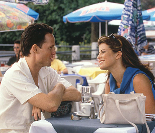
Two Shot

There are a few variations on this one, but the basic idea is to have a comfortable shot of two people. Often used in interviews, or when two presenters are hosting a show.
A "One-Shot" could be a mid-shot of either of these subjects. A "Three-Shot", unsurprisingly, contains three people.
Two-shots are good for establishing a relationship between subjects. If you see two sports presenters standing side by side facing the camera, you get the idea that these people are going to be the show's co-hosts. As they have equal prominence in the frame, the implication is that they will provide equal input. Of course this doesn't always apply, for example, there are many instances in which it's obvious one of the people is a presenter and the other is a guest. In any case, the two-shot is a natural way to introduce two people.

Close Up (CU)

Cut-In (CI)
Like a cutaway, but specifically refers to showing some part of the subject in detail.
Can be used purely as an edit point, or to emphasis emotion etc. For example, hand movements can show enthusiasm, agitation, nervousness, etc.
In the closeup shot, a certain feature or part of the subject takes up most of the frame. A close up of a person usually means a close up of their face (unless specified otherwise).
Close-ups are obviously useful for showing detail and can also be used as a cut-in.
A close-up of a person emphasizes their emotional state. Whereas a mid-shot or wide-shot is more appropriate for delivering facts and general information, a close-up exaggerates facial expressions which convey emotion. The viewer is drawn into the subject's personal space and shares their feelings.
A variation is the choker shot which is typically framed on the subject's face from above the eyebrows to below the mouth.

Wide Shot (WS)

In the wide shot, the subject takes up the full frame. In this case, the boy's feet are almost at the bottom of frame and his head is almost at the top. Obviously the subject doesn't take up the whole width and height of the frame, since this is as close as we can get without losing any part of him. The small amount of room above and below the subject can be thought of as safety room — you don't want to be cutting the top of the head off. It would also look uncomfortable if his feet and head were exactly at the top and bottom of frame.


Extreme Wide Shot (EWS)
In the extreme wide shot, the view is so far from the subject that s/he isn't even visible. The point of this shot is to show the subject's surroundings.The EWS is often used as an "establishing shot" - the first shot of a new scene, designed to show the audience where the action is taking place. It is also useful in scenes where the action is very spread out. For example, in a war movie an extreme wide shot can show the scale of the action.


Weather Shot

In this type of shot the subject is the weather. The sky takes up at least 2/3 of the frame. This type of shot is common in television programs where the weather is of particular interest, e.g. sports shows.
Although the usual purpose of this shot is to show the weather, it is also useful as an establishing shot, for setting the general mood or for overlaying graphics. A weather shot doesn't have to show the sky. Other shots often used to illustrate weather include:
Puddles, drain spouts or any example of rainwater flow.
Trees or anything else blowing in the wind.
People sunbathing.
Snowmen, snowball fights, snow sledding, etc.

Friday, 23 September 2011

Match on Action

Match on action : A cut made on action or movement between two shots in which the action has been overlapped either by repetition of the action or by the use of more than one camera.

Shot reverse shot: is a film technique where one character is shown looking at another character (often off-screen), and then the other character is shown looking back at the first character. Since the characters are shown facing in opposite directions, the viewer assumes that they are looking at each other.

180 degrees rule: A rule stating that a camera should be placed somewhere inside 180 degrees on a particular side of the invisible line of a shot containing two people filmed in sequence.  If the camera crosses the line, confusion results for the film viewers, because it makes it look like the people are switching places as one watches the film.